 flex常见布局
# 网格布局
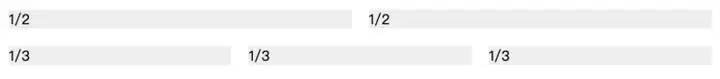
# 基本网格布局
flex:1使得各个子元素可以等比伸缩
<div class="Grid">
    <div class="Grid-cell">1/2</div>
    <div class="Grid-cell">1/2</div>
</div>
<div class="Grid">
    <div class="Grid-cell">1/3</div>
    <div class="Grid-cell">1/3</div>
    <div class="Grid-cell">1/3</div>
</div>
1
2
3
4
5
6
7
8
9
2
3
4
5
6
7
8
9
.Grid {
  display: flex;
}

.Grid-cell {
  flex: 1;
  background: #eee;
  margin: 10px;
}
1
2
3
4
5
6
7
8
9
2
3
4
5
6
7
8
9
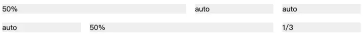
# 百分比布局
某个网格的宽度为固定的百分比,其余网格平均分配剩余的空间。
通过flex的第三个属性,也就是flex-basis来定义元素占据的空间。
<div class="Grid">
    <div class="Grid-cell col2">50%</div>
    <div class="Grid-cell">auto</div>
    <div class="Grid-cell ">auto</div>
</div>
<div class="Grid">
    <div class="Grid-cell">auto</div>
    <div class="Grid-cell col2">50%</div>
    <div class="Grid-cell clo3">1/3</div>
</div>
1
2
3
4
5
6
7
8
9
10
2
3
4
5
6
7
8
9
10
.col2 {
  flex: 0 0 50%;
}
.col3 {
  flex: 0 0 33.3%;
}
1
2
3
4
5
6
2
3
4
5
6
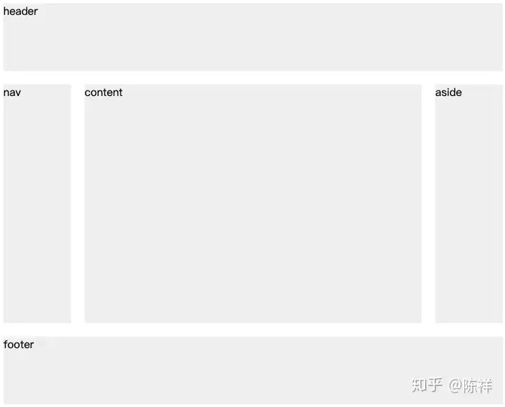
# 圣杯布局
圣杯布局(Holy Grail Layout:)指的是一种最常见的网站布局。
页面从上到下,分成三个部分:头部(header),躯干(body),尾部(footer)。其中躯干又水平分成三栏,从左到右为:导航、主栏、副栏。
container的flex-direction: column这样保证了header,body,footer是在垂直轴上排列
header,footer的高度可以通过flex: 0 0 100px来控制
nav可以通过order:-1来调整位置(order属性定义项目的排列顺序。数值越小(包含负值),排列越靠前,默认为0)
通过@media (max-width: 768px)来调整小屏幕的页面结构
<div class="container">
    <header class="bg">header</header>
    <div class="body">
        <main class="content bg">content</main>
        <nav class="nav bg">nav</nav>
        <aside class="ads bg">aside</aside>
    </div>
    <footer class="bg">footer</footer>
</div>
1
2
3
4
5
6
7
8
9
2
3
4
5
6
7
8
9
.container {
  display: flex;
  flex-direction: column;
  min-height: 100vh;
}

.body {
  display: flex;
  flex: 1;
}

header,
footer {
  flex: 0 0 100px;
}
.content {
  flex: 1;
}

.ads,
.nav {
  flex: 0 0 100px;
}

.nav {
  order: -1;
}

.bg {
  background: #eee;
  margin: 10px;
}

@media (max-width: 768px) {
  .body {
    flex-direction: column;
    flex: 1;
  }

  .nav,
  .ads,
  .content {
    flex: auto;
  }
}
1
2
3
4
5
6
7
8
9
10
11
12
13
14
15
16
17
18
19
20
21
22
23
24
25
26
27
28
29
30
31
32
33
34
35
36
37
38
39
40
41
42
43
44
45
2
3
4
5
6
7
8
9
10
11
12
13
14
15
16
17
18
19
20
21
22
23
24
25
26
27
28
29
30
31
32
33
34
35
36
37
38
39
40
41
42
43
44
45
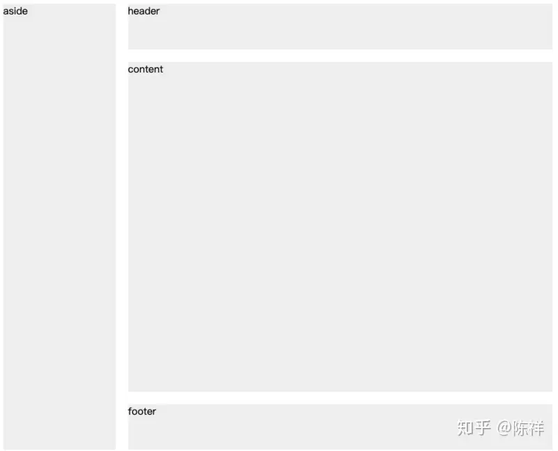
# 侧边固定宽度
侧边固定宽度,右边自适应
<div class="container1">
    <div class="aside1 bg">aside</div>
    <div class="body1">
      <div class="header1 bg">header</div>
      <div class="content1 bg">content</div>
      <div class="footer1 bg">footer</div>
    </div>
</div>
1
2
3
4
5
6
7
8
2
3
4
5
6
7
8
.bg {
  background: #eee;
  margin: 10px;
}
.container1 {
  min-height: 100vh;
  display: flex;
}
.aside1 {
  /* flex: 0 0 200px; */
  flex: 0 0 20%;
}
.body1 {
  display: flex;
  flex-direction: column;
  flex: 1;
}
.content1 {
  flex: 1;
}
.header1, .footer1 {
  flex: 0 0 10%;
}
1
2
3
4
5
6
7
8
9
10
11
12
13
14
15
16
17
18
19
20
21
22
23
2
3
4
5
6
7
8
9
10
11
12
13
14
15
16
17
18
19
20
21
22
23
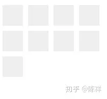
# 流式布局
每行的项目数固定,会自动分行。
这里主要使用到了flex-flow: row wrap使得子元素水平排列,并且换行
<div class="container2">
    <div class="item"></div>
    <div class="item"></div>
    <div class="item"></div>
    <div class="item"></div>
    <div class="item"></div>
    <div class="item"></div>
    <div class="item"></div>
    <div class="item"></div>
    <div class="item"></div>
</div>
1
2
3
4
5
6
7
8
9
10
11
2
3
4
5
6
7
8
9
10
11
.container2 {
  width: 200px;
  height: 150px;
  display: flex;
  flex-flow: row wrap;
  align-content: flex-start;
}

.item {
  box-sizing: border-box;
  background: #eee;
  flex: 0 0 20%;
  height: 40px;
  margin: 5px;
}
1
2
3
4
5
6
7
8
9
10
11
12
13
14
15
2
3
4
5
6
7
8
9
10
11
12
13
14
15
上次更新: 2026/04/06, 07:07:24